Lenovo Yoga 3 Pro Review: Refreshed With Faster Core M
by Brett Howse on March 13, 2015 8:00 AM ESTBattery Life
With a similar display and a smaller battery, Lenovo will need to have upped their overall system efficiency to come close to the Yoga 2 Pro. The Yoga 3 Pro has a 44 Wh battery, as compared to a 55 Wh in the Yoga 2 Pro. Core M is certainly going to be more efficient than Haswell-U, but it is still a big ask to drop the battery size by 20% and keep the battery life the same. As we saw with the XPS 13, high resolution displays are a big hindrance to overall battery life.
To test battery life, we set all of the displays to 200 nits, and the laptop is set to power saving mode. Our light test consists of web browsing, and for our heavy test we ramp up the number of pages loaded, add in a 1 MB/s file download, and play a movie.
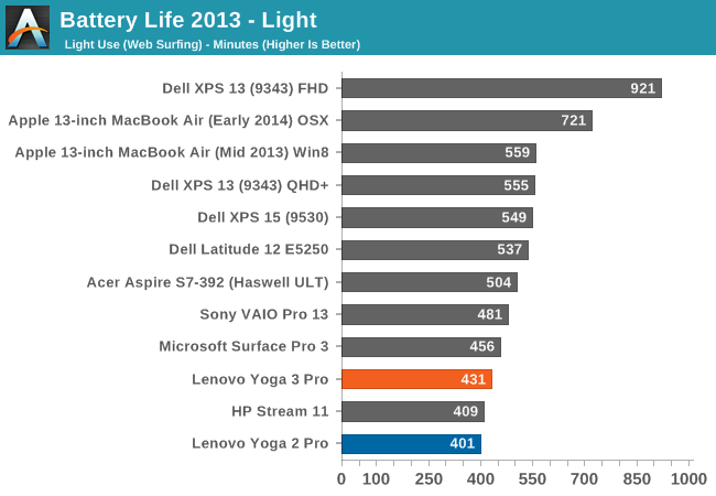
The Yoga 3 Pro manages 30 additional minutes over the Yoga 2 Pro on our light test, which is more of a test of display efficiency than CPU, since the CPU is not being worked very hard. It may seem like a poor score, but due to the smaller battery size in the Yoga 3 Pro, it is certainly an improvement. It will not give you the all-day battery life of the XPS 13 though. With the same resolution display, the XPS 13 gets an additional two hours of battery life, but it also has a 52 Wh battery.
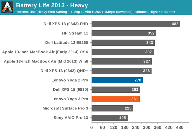
On our heavy test, the Yoga 3 Pro drops behind the Yoga 2 Pro in battery life, and falls well short of other Ultrabooks. The XPS 13, with the same resolution display, manages just over an hour more battery life in this test. We also like to look at a normalized score which takes the battery size out of the equation so we can look at overall efficiency of the system.
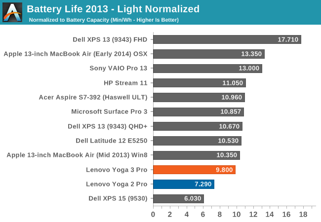
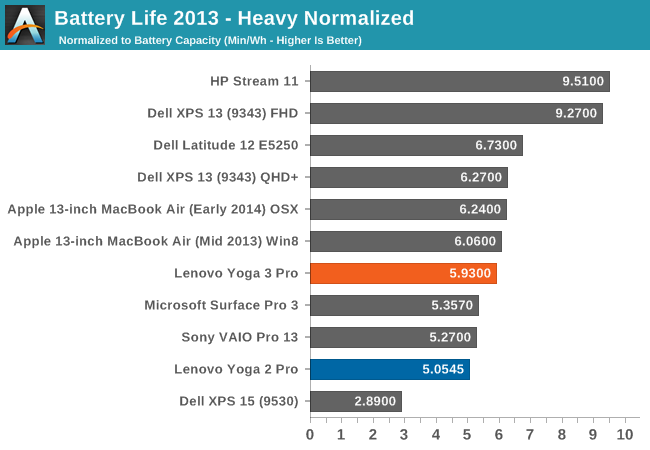
Here we can see how much progress Lenovo has made over the Yoga 2 Pro. On our light workload, the Yoga 3 Pro is much more efficient than the Yoga 2 Pro, and comes close to the competition. The XPS 13 is still a bit more efficient though with the 3200x1800 resolution, which is the main power draw in this test. On the heavy score, Lenovo is once again quite a bit higher than the Yoga 2 Pro, and is inching in on the MacBook Air and XPS 13. They are not quite there though, which makes the smaller battery choice have an even greater impact on the overall battery life.
Battery Charge Time
One aspect of mobility is battery life, but charge time can also play a factor. The Yoga 2 Pro had a larger battery, and also came with a larger charger.
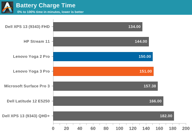
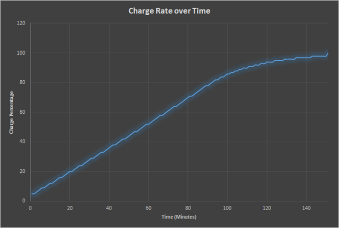
The Yoga 3 Pro charges roughly the same as the Yoga 2 Pro. It would have been nice to see a faster charge rate here though due to the smaller battery size, but that is not the case.
The Yoga 3 Pro does not spend very much time hovering around 99% like some devices do, and the charge rate is very linear until over 80%.
Wi-Fi
One of the pain points on the Yoga 2 Pro was the included single band Wi-Fi card. The maximum connection speed on the Yoga 2 Pro was only 300 Mbps, and sustained transfers are much lower. Lenovo did replace the single band card with the Intel Dual Band Wireless-AC 7260 later in the model run, which improved matters quite a bit. For the Yoga 3 Pro, they have switched to a Broadcom 802.11ac solution, which offers connection speeds up to 866 Mbps.
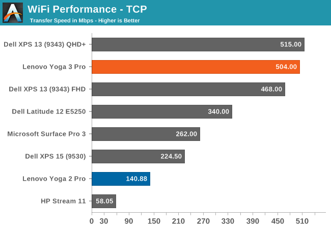
On a $1000+ device, the Yoga 2 Pro had unacceptable wireless performance, but the Yoga 3 Pro suffers no such indignities. The Broadcom 802.11ac solution is one of the fastest we have tested on various platforms, and here again performance is very good with over 500 Mbps transfer rates.
Speakers
Lenovo has upgraded the speakers in the Yoga 3 Pro as well. JBL now provides the two speakers, and they are powered by a 1.5 watt x 2 amplifier. In addition, they have implemented WAVES MaxxAudio, which switches the speaker profiles depending on which mode the device is in. The Speakers are down-firing when in laptop mode, but fire up in Stand Mode, so they have a different equalizer mode for each orientation.
I tested the dB output in all four modes. The loudest was in laptop mode, where I hit about 80 dB playing music with the meter 1 inch over the touchpad. This is not a very strong result, and I would classify the Yoga 3 Pro as a device which cannot fill a room with music. The next loudest was tablet mode, at 76 dB, followed by tent mode at 73 dB and stand mode at only 67 dB.
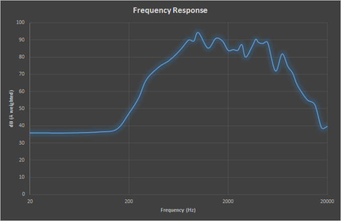
Looking at the frequency response of the Yoga 3 Pro, we have not the best result either. The push to make devices thinner and thinner means that there is not a lot of room for quality speakers. The Yoga 3 Pro has almost no response at all below 200 Hz, and really there is not much response at all below 400 Hz. As great as the design of the Yoga 3 Pro can be for media consumption, the speakers leave a lot to be desired.
Noise
Even though the Core M can be put in a completely fanless device, Lenovo has included a fan to keep the temperatures down. On balanced or power saver configurations, the fan is normally either off, or on very little. During workloads, the fan can kick in, and for the most part it is fairly quiet. It is certainly audible though. The noise floor in my room is 35 dB, and at low loads, the fan would kick on around 36.3 dB. Heavier workloads would ramp up to 37 dB. So it is not overly loud, but you can hear it.
Software
Due to recent events, included software needs to be brought up. The Yoga 3 Pro that was sent as a review sample did not have Superfish, and Lenovo has stopped installing it on new devices. This was a major blow against Lenovo’s reputation, but it also brought to light how much extra software is installed on PCs, and made people realise that they not only do not need it, but it can harm the experience, and possibly their system security.
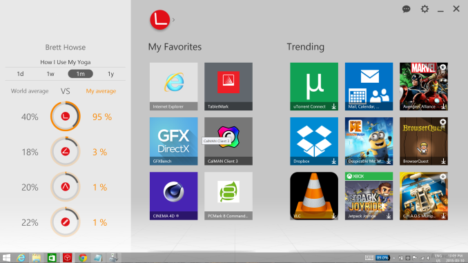
The Yoga 3 Pro does come with quite a bit of extra software. Some of it, like the Harmony software, is kind of useful. Some people may also enjoy the trial version of McAfee. A lot of it is not very useful though, at least not for me. I can’t speak for everyone out there, because if I say software X is not useful, I am sure someone will disagree.
I am not here to defend Lenovo for Superfish. It was clearly a bad idea from the start, and I am sure there has been some fierce internal discussion within the company about how they even fell for it.
The only good thing to come out of Superfish was that it has woken the industry up, and they are taking action. Lenovo has stated that they are going to “significantly reduce preloaded applications” and they want to be the leader in cleaner PCs. They have stated that by the time Windows 10 is launched on Lenovo products, they will only include the OS, hardware drivers and software to power said hardware, security software, and Lenovo applications. This will be a good step, because it has become a big problem. Hopefully they will go far enough.
For those that are still wary, any PC purchased from a Microsoft Store will be a “Signature Edition” of that device, and all bloatware will not be installed.




113 Comments
View All Comments
KZ0 - Friday, March 13, 2015 - link
Why did they have to break the keyboard! So close to perfect, but the keyboard is important!fokka - Friday, March 13, 2015 - link
the yoga line is nice and the yoga 3 pro could be one killer machine, but when i have to press key combos for simple things as adjusting brightness, or to skip a track this would be just a big step back in usability for me.like the author, i'm also not a fan of the rgbw-display, especially when sharp makes a display of the same resolution which is just so much nicer.
and the third point would be the middling battery life. i would give up the 1800p screen in a heartbeat if it meant i could get the same battery life as the 1080p xps 13.
i'm still not the biggest fan of core m, even with a little fan helping out.
i guess for me that means the time isn't quite here yet for the super-slim 12mm for factor and in this generation and probably the next i'd still be more inclined to go with a 15-17mm thick device, simply to have something a bit more future proof in the cpu and especially gpu department.
if more manufacturers could now offer 16:10, or even 15:10 screens on their future devices, that would be much appreciated.
fokka - Friday, March 13, 2015 - link
oh sorry, now i posted the whole shebang, when i only wanted to share my sentiments about the keyboard... edit option, anyone?wintermute000 - Saturday, March 14, 2015 - link
someone in lenovo has obviously gotten hold of some kind of focus group testing or user survey that says most 'normals' don't use the F keys, and gone ahead and loaded the shotgun (pointed at their feet). Observe the X1 carbon (though maybe the latest variant went back to the F keys?), yep thinkpad users don't use F keys... not.....My company recently got a laptop refresh where we were given the choice of T440s or X1s. The first wave of people went X1s en masse and there was a seriously high return rate after people realised how much of a PITA the new, no-F-key layout was.
MrSpadge - Sunday, March 15, 2015 - link
I agree, this is ridiculous especially for a "Pro" version. And they still have so much space left at the top of the current keyboard.Wwhat - Sunday, March 15, 2015 - link
It seems the new paradigm to remove stuff and reduce user convenience, samsung did it with their new phones, apple did it with their new single-port laptop, and you see more and more devices being released with pointlessly reduced functionality.But as for 'pro', I'm not sure any 'pro' would get lenovo after the spy-ware fiasco.
I know lenovo is not an option for me after that.
Gigaplex - Monday, March 16, 2015 - link
"Pro" use in the Enterprise would just use a corporate image, rather than using whatever Lenovo installed.Wwhat - Saturday, March 21, 2015 - link
Fair point, but seeing we hear more and more about things embedded in firmware and BIOS I'm not sure I'd trust it either way. Especially the BIOS would only require a cooperation of lenovo to 'enhance' their system.It's the nature of the nastiness they were exposed as bundling, it was too complex and devious to brush off. In my opinion at least. And it ruined any trust I have.
miahshodan - Tuesday, March 17, 2015 - link
I don't mind the function keys as much as having keys in the wrong place. For instance the right shift key should be directly below the enter key and the forward slash / should be below the '. things like that kill typing speed.Wwhat - Tuesday, March 24, 2015 - link
Odd view, the shift key isn't too bad if you type with ten fingers since it is where it suppose to be except the right part missing, and people can probably adapt to that.As for the forward slash, that is always below the middle between ; and ' on standard keyboards, check wikipedia to see. And it's actually the ctrl key which isn't where you expect it.