Amazon Kindle Fire Review
by Anand Lal Shimpi & Vivek Gowri on November 29, 2011 3:31 AM EST- Posted in
- Tablets
- Mobile
- Amazon
- Kindle Fire
- Kindle
Mario Twins
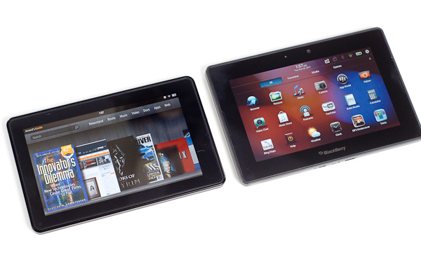
Rumor had it that in order to save time (and likely cost) in bringing the Fire to market, Amazon had opted to use the same design as the BlackBerry PlayBook courtesy of the ODM that made both: Quanta.
ODMs like Quanta will build anything you want or they'll do slight modifications to an existing design to suit your needs. The idea is you don't need to be an expert at everything. If your differentiation is primarily software and you just need a fast hardware platform, Quanta (or Pegasus or Foxconn, etc...) will give you that and let you roll your own software stack on top of it. It's not all that uncommon in the industry. This is actually how companies like Marvell work in the SSD space as well. They'll give you the hardware, but the most successful drive makers simply use the Marvell hardware as a base platform - they all write their own firmware.
Aesthetically, the Kindle Fire looks a lot like the PlayBook. The dimensions, screen size/resolution and even build quality are eerily reminiscent of one another although the PlayBook is tangibly larger. Both tablets have a large screen bezel (the PB's is bigger) and soft touch plastic on the back. The power/lock button on the Kindle Fire is also quite similar to what's used on the PlayBook. It's in a different location and is much easier to actuate but it's clear that even the buttons came from a similar parts bin.
A look inside both devices shows a different arrangement of components and a different layout on each motherboard. Our own Brian Klug spotted a curious reference on each board however: the PlayBook's board is labeled Rev. G while the Fire's board is labeled Rev. F. Is it possible that the two boards are simply different revisions of one another?
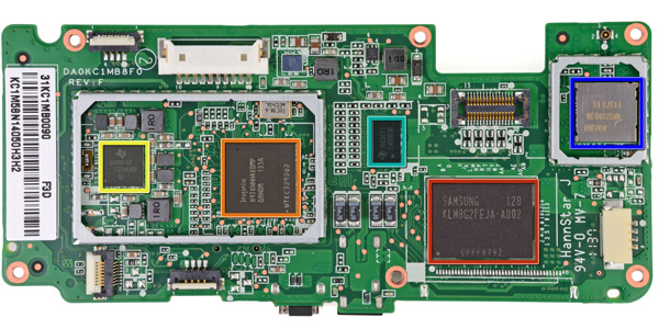
Image Courtesy iFixit - Kindle Fire Motherboard
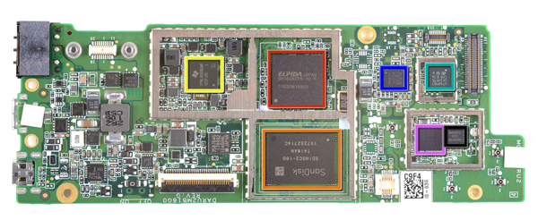
Image Courtesy iFixit - Kindle Fire Motherboard
Either way it's clear Amazon departed from its usual unique design approach with the Kindle Fire. While previous Kindles were fairly recognizable among a sea of devices, the Kindle Fire looks and feels like a PlayBook. In fact, when it's off and sitting on your desk, you'd be hard pressed to tell that it was something made by Amazon. The large 'kindle' lettering on the back was likely designed to address this brand identity issue, but it really was the only thing Amazon could have done given the generic looking platform.
Looks aren't a major concern of mine but I do wonder what we can conclude from this. Either the Kindle Fire was a rushed project to catch the 2011 holiday shopping season or it's a sign that value tablets can't look very special, or perhaps both?
Simplicity in Hardware
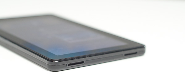
Despite the physical similarities to the PlayBook, Amazon whittled down the number of buttons on the Kindle Fire to just one: power/lock. Volume controls are entirely in software, and to be honest I don't miss the physical buttons. As this isn't a smartphone, I don't need to worry about quickly silencing a ring or increasing the volume of a call. The tradeoff here makes sense.
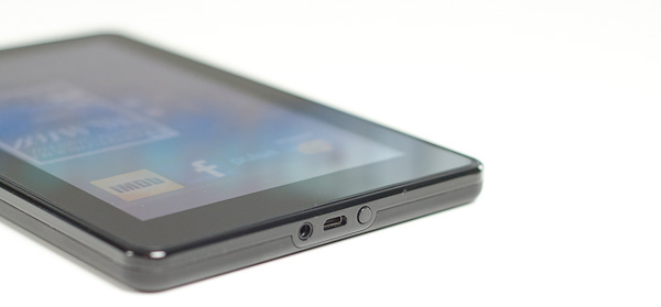
As I mentioned before, the round power/lock button is easy to actuate. The bigger problem is the button's location: at the bottom of the Kindle Fire. On the bright side it does keep the button out of your way when you're reading, it just happens to be in the exact opposite location of where years of using modern smartphones/tablets have taught us to expect it. Then again, an oddly placed power/lock button isn't too big of a deal when you've got a configurable software screen lock.
A 1/8-inch headphone jack and micro USB port keep the power/lock button company. Amazon doesn't ship the fire with a micro USB cable, instead you just get a power brick with a micro USB end for charging the Fire. To Amazon's credit, to use the Fire as a Kindle you never need to hook it up to your Mac or PC. A standard USB cable is only really needed for getting your own music, videos or apps onto the device.
There are a pair of stereo speakers on the opposite end of the device. The volume control feels non-linear and the speakers get loud enough to make their position a bit awkward. Hearing loud noises from one side of the device and not the other isn't really desirable, particularly since you'll likely be watching movies on the Kindle Fire in landscape mode.




70 Comments
View All Comments
StormyParis - Tuesday, November 29, 2011 - link
The original Nook Color, at $200, was an heck of a deal. The current proprietary tablets (Nook Color 2 and Kindle Fire) are a lot less compelling due to the arrival of non-proprietary tablets at the same price point. Those are.. non-proprietary, and offer arguably better features.I'm still happy ith my original Nook Color. WHen it gets replaced, if it does, it probably will be by a true, un-walled-gardened, tablet.
Wierdo - Tuesday, November 29, 2011 - link
Ars had a good review of the Nook tablet here:http://arstechnica.com/gadgets/reviews/2011/11/lea...
"I have less doubt about the Nook Tablet as a capable product than I did about the Kindle Fire. The experience is not frustrating or jagged and doesn't feel as unfinished... However, I do have some doubts about the value of the Nook ecosystem. Amazon's selection in all categories seems a bit more diverse..."
rruscio - Tuesday, November 29, 2011 - link
I wanted an entry level tablet that was an eReader. Check. But ...1) I really miss having Skype on here. Really.
2) The lack of Google native apps results in my using the browser for gmail, Reader, et al. And then Google gives me links to all the other apps. Not the most comprehensible experience.
3) The single/double/drag tap issues are more annoying than they need to be.
4) wiFi isn't immediately available when the device wakes up. It takes some number of seconds to make the connection. The "wiFi not available" error is easily resolved by me tapping again. Why isn't is resolved by the app / OS waiting instead?
5) The entire software experience seems less than fully baked. Yeah, I get the Christmas rush thing, but I don't have experience with Amazon updating software. Hope isn't change.
6) The device feels familiar because I'm used to my Droid Inc. The speed is better, and the screen size is acreage versus postage stamp.
If there's ever a phone that just 1) phone calls 2) text messaging 3) wiFi hot spot 4) non-larcenous plan, I'd predict that, and a tablet in this form factor, will kill the smart phone business.
Great review.
genomecop - Thursday, December 1, 2011 - link
1. I dont miss it at all.2. Not true. It comes preloaded with an email app that has gmail setup.
3. Dont know what your talking about never have this issue
4. Dont have this issue and I use mine all day long.
5. Have no problem with the software at all. Everything works very smoothly.
Just want to add...I've had an Ipad since launch and I have since stopped carrying it around. This fits in my coat pocket for use at the gym while doing cardio. At work, on my desk for quick web browsing. RSS feed for all Tech related news. Gmail. Reading on the subway. Uses my phones hotspot in the cab for use. Quick download of movies. I think its a great device.
mcturkey - Tuesday, November 29, 2011 - link
In your conclusion, you state that $199 should be the entry level price point now. I'm anxiously awaiting your review of the Nook Tablet to see if that extra $50 is worth it (excluding my personal bias towards B&N for their willingness to fight back against Microsoft's ridiculous patent war against Android).tipoo - Tuesday, November 29, 2011 - link
Agreed, the new Nook looks interesting. I remember reading it has a larger battery than the Fire. Locking all but 1GB of its memory to B&N content sucks, but I'm sure someone will take that limitation off.Lucian Armasu - Tuesday, November 29, 2011 - link
Hardware wise, the extra 8GB of internal storage, extra 512 MB of RAM, and microSD slot, I think it;s worth it. Still I think the extra $50 would be worth it a lot more with the full Android experience. If the other Android manufacturers could put android 4.0 on an equivalent tablet to Kindle Fire, and price it at $250, I'd pick that one any day. You can still get all Amazon's services on the full Android, too, so no point limiting yourself for $50.nace186 - Tuesday, November 29, 2011 - link
I don't understand why you are comparing the Fire with all the tablet out there that's in a different class. What it should really be compare to is the Nook Color, and the Nook Tablet. Which either of them were included.Wierdo - Tuesday, November 29, 2011 - link
Yeah I read a review on Ars about it and they think the Nook tablet is a more capable product but Amazon has the edge in the ecosystem department, link posted on this thread somewhere if interested.VivekGowri - Tuesday, November 29, 2011 - link
We'll have a Nook Tablet review that touches on the comparisons to the Kindle Fire relatively soon :)