BlackBerry Torch 9800 Review: Keeping RIM's Flame Alive
by Brian Klug on September 1, 2010 7:00 AM EST- Posted in
- Smartphones
- Torch
- BlackBerry
- Mobile
Rest of Platform
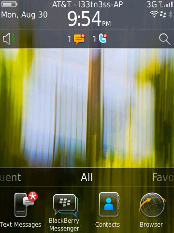
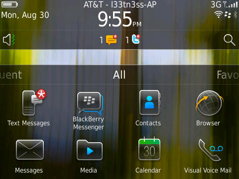
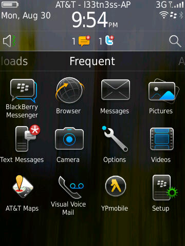
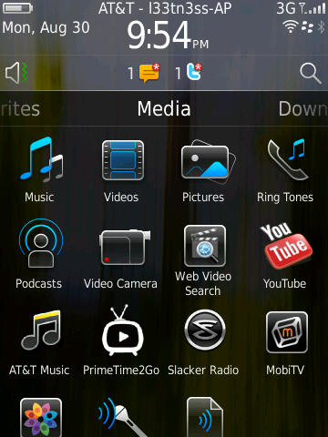
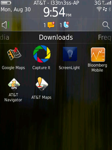
The other big change on BlackBerry 6 is the home screen, which is definitely an evolution of BlackBerry OS 5. If you’re coming from there, this is going to feel like largely familiar territory. By default there’s one row of applications in the navigation bar.
What’s different is that you can now drag the panel left and right, from all to favorites, media, downloads, and frequent.
Press and hold, and you can drag the navigation bar up to show one, two, or three rows of applications. Tap the top, and you’ll cycle between showing the bar, and not showing the bar. What makes the platform feel a bit slow is that there seems to be some built in delay between when you swipe from panel to panel, and when the transition takes place.
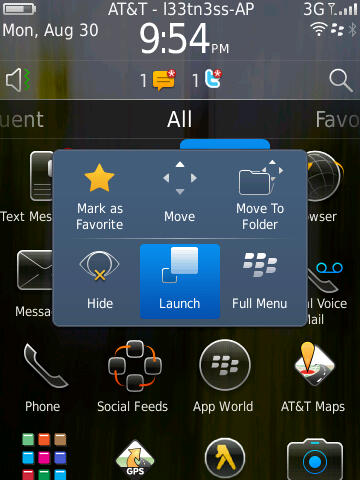
You can also long press on icons in the launcher and either move them around, or organize them. What’s a bit strange here is that after you’ve tapped and selected move to rearrange icons, the trackpad is then used for actually moving icons - you can’t use the touchscreen. This is just a bit confusing, and probably the only glaring part of the OS that shows a touchscreen/trackpad disparity.
There’s also nothing you can do with the blank unused space when you’ve closed the navigation bar. This would be an otherwise ideal place for some Android-like widgets.
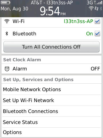
Up at the top is what RIM is calling the quick access area. Tap in the upmost portion, and you’ll bring down a window for managing active connections, alarms, and status. It makes sense - tapping on the region with the clock, signal status, and date should bring you to a pane where you can manage it.
I’ll also note that up at the top is the carrier string, and after the dash is the SSID of the active WiFi network you’re connected to. I don’t really know why RIM chose to present you with the name constantly, but there it is.
Down below that is the notifications bar, which populates with new notifications - things like new messages, BBMs, email, twitter replies, and even calendar alerts. Tap on it, and the bar swings down revealing a detailed and itemized look at what’s going on. Tapping on an individual alert brings you directly to whatever triggered it. What’s frustrating here is that there isn’t any quick way to clear everything - for that, you have to either manually read everything, or go in messages, shift select everything, and mark opened.
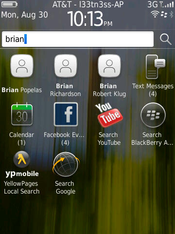
Likewise, tap on the speaker symbol, and you can change the sound and alert policy. Start typing or tap the magnifying glass, and you’re using universal search.
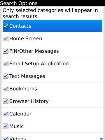
I found myself using universal search quite a bit, as it does a good job. By default, it searches everything, including BBM, but doesn’t quite search inside conversation text itself. Thankfully you can enable and disable searching basically anything on the device by tapping menu and selecting search options while in the search bar.
Before I go any further into the preinstalled applications, I want to make mention of BlackBerry 6’s completely revamped options and setup windows. Smartphones are no doubt still complicated to many, and getting everything configured on a brand new device for a first timer is no doubt still daunting. Device manufactures and carriers often look at return rates as an important measure of device success. It’s obvious with this feature that RIM wants to both make initial setup straightforward, but also make sure it’s got the low return rate metrics to back up how usable their devices are.
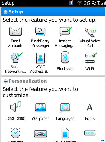
The setup screen does look nice. Right after you power on the device for the first time, you’re essentially dumped here. It makes sense really, probably the first thing I always do on a device is setup my email accounts and sync calendars and contacts. True to form, all of that is here.
Further down are related personalization options, and then tutorials. Even though I might not need features like this, it really does help make the setup process and initial getting started learning curve less of a brick wall for your average device shopper.
The only downside is that right next to ‘Setup’ is ‘Options.’
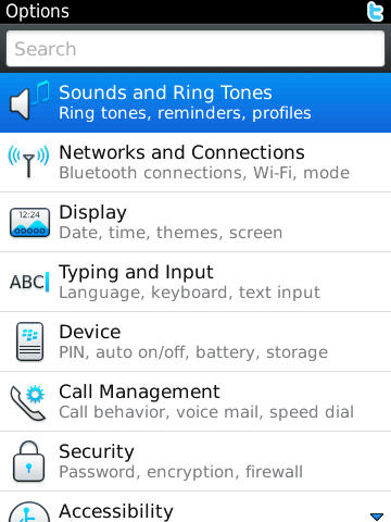
Options is what it should be - all the controls and settings are listed under 9 different categories, or you can start typing and find something fast not unlike System Preferences on OS X. Everything in here is nicely organized, and searching for specific things gets you around pretty speedily as well.
It’s admittedly a bit confusing to have two different settings applications next to each other, though I understand why RIM did it here. There’s some duplication of functionality - for example, you can ‘setup’ WiFi or get to the menu from Options, both of which get you to the same place.






41 Comments
View All Comments
brianmc - Wednesday, September 1, 2010 - link
When are you going to review this line of phones?StealthX32 - Wednesday, September 1, 2010 - link
Agreed. Especially since your sister site Dailytech keeps touting them as the "fastest Android smartphone".Anand Lal Shimpi - Wednesday, September 1, 2010 - link
I'm actually working on that right now :) I've had the Epic 4G for a little while now and I'm just in the middle of writing up the review :)Take care,
Anand
synaesthetic - Friday, September 3, 2010 - link
Really interested in hearing your thoughts, Anand. I've been staring very hard at the Samsung Vibrant as my old myTouch 3G is just too slow!I haven't flashed it to Cyanogenmod 6 yet (will probably do that today or tomorrow) so I'm not sure what speed boosts I'll get there, but the Vibrant/Galaxy S's AMOLED is just stunning!
linccsdfd - Wednesday, September 1, 2010 - link
is my love
this is a very good !
FATCamaro - Wednesday, September 1, 2010 - link
Yeah, I've been waiting patiently for something to push iphone4 off the top of all the charts. Maybe the Galaxy S will do it. Then it only needs a better display, camera, and apps to catch up.bplewis24 - Wednesday, September 1, 2010 - link
Since when has the iPhone4 been at the top?FATCamaro - Wednesday, September 1, 2010 - link
Not at everything, but a lot of important factors like below.http://images.anandtech.com/graphs/blackberrytorch...
http://images.anandtech.com/graphs/blackberrytorch...
Performance isn't too bad either. e.g.
http://images.anandtech.com/graphs/droidx_07191023...
sammsiam - Wednesday, September 1, 2010 - link
The Droid X comes with 8GB built in memory for OS & Apps and an additional 16GB microSDHC card. It supports upto 32GB cards for a total of 40GB possible.see this site:
www.motorola.com/Consumers/US-EN/Consumer-Product-and-Services/Mobile-Phones/ci.Motorola-DROID-X-US-EN.alt
Brian Klug - Wednesday, September 1, 2010 - link
I had it down in my own table right, it just didn't get copied over somehow. Same for the EVO 4G. Fixed!-Brian