BlackBerry Torch 9800 Review: Keeping RIM's Flame Alive
by Brian Klug on September 1, 2010 7:00 AM EST- Posted in
- Smartphones
- Torch
- BlackBerry
- Mobile
The whole device is rimmed with a shiny silver chrome that feels slippery but surprisingly doesn’t show fingerprints. So far it’s gone a solid week in my pocket without picking up any scuffs. The chrome band extends to the top and around to the back of the phone.
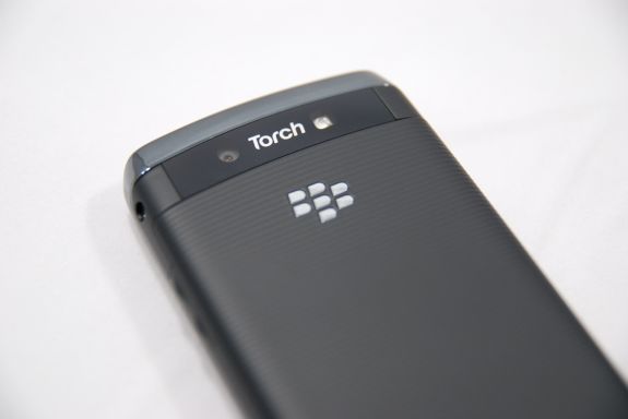
While we’re on the back, up top on the left is the 5 megapixel camera, on the right is the LED flash. BlackBerries have been getting more extravagant backsides as of late, with the earlier BlackBerry Bold sporting a leather battery cover. The Torch is a bit different, eschewing real leather for a soft touch grippy material that’s subtly ribbed for your, erm, hand’s pleasure. The chrome BlackBerry logo is inset and does seem to collect dust and grime as a result.
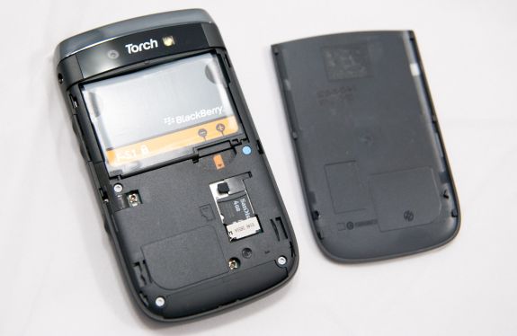
Getting the battery door off is a bit of a struggle since you can’t grip the whole phone - it wants to slide open along the same axis the battery door slides on and off along. I’ve found the best way is to align your hands so you brace against the bottom of the phone, and use both thumbs to press and push the door off. Even then, it’s just a difficult thing to get off. I guess the upside is that it won’t come off unless you really want it to.
After you’ve got that cover off, you can get access to the battery, SIM card, and microSD card. I like what they did here with putting a small rubber flap that stops the microSD card from coming out, but not making removal incredibly complicated. The Torch comes with a 4 GB class 2 SDHC card with SanDisk branding installed, which isn’t anything stellar, but not bad. The Torch uses the 4.7 Whr BlackBerry F-S1 battery, smaller than the 6 Whr battery in the Bold and other BlackBerries.
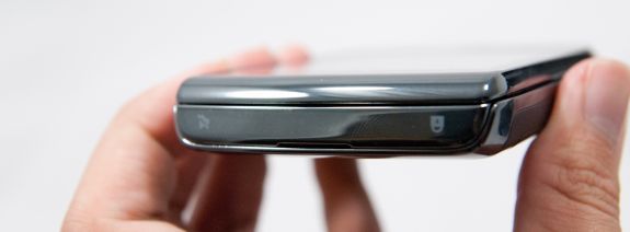
On the top of the Torch is a long chrome strip that serves as a rocker for two buttons. On the left, the button for standby/lock, on the right, the in-call mute button.
This standby button location is really my only major complaint about the design of the Torch, and is a little awkward. First of all, it’s gigantic. Second, it doesn’t take much pressure to toggle. The combination of both is that I found myself frequently turning the Torch on in my pockets. It’s simple to do, really - if you have capacious pockets like I do and plunk your phone down inside, you run the risk of accidentally turning the phone back on again. The button icons also seem like they’re silkscreened on the chrome plastic - I’m sort of worried that they’ll eventually rub off.
I realize most BlackBerry users wear a belt holster or case and thus enjoy the benefits of the magnet sensor and all that goodness, but I still just use pockets. Either way, if you aren’t using one of those, be careful that you deposit the Torch right end up, or I guarantee you’ll turn the thing right back on again as soon as it hits the bottom of your pocket.
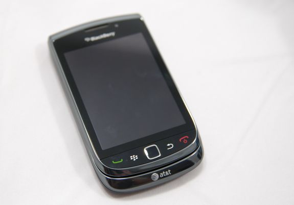
On the front are the four capacitive buttons, and the optical trackpad. The Torch doesn’t go fully capacitive, instead requiring you to press the button down to confirm input. I like this a lot more than the alternative that seems the norm with Android devices - just taking unsanitized capacitive input. The only downside is a small seam between the screen and the buttons where dust and other grime can intrude. The optical trackpad is flawless, honestly. As an aside, the old trackball was an absolutely egregious single point of failure that spelled the end of many a BlackBerry. I find myself wondering how people even got along without a solid state sensor like what’s in here. I’ve been in conference rooms with stray BlackBerry trackball assemblies on the table before, no joke.
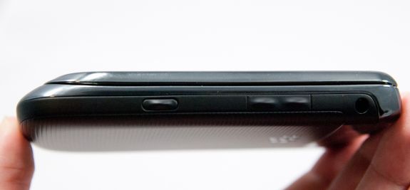
The right side of the phone has the 3.5mm headset jack up top, volume up down buttons, and the Torch’s sole convenience button. That’s right, there’s no convenience button on the left side. Apparently this was a design choice to simplify BlackBerry rather than something imposed by space constraints or design limitations. Whatever the cause, if you’re used to mapping things to the left side, you’ll quickly find this annoying. The buttons themselves are rather fascinating, as they’re raised rubber and have a mechanism that’s pretty sensitive.
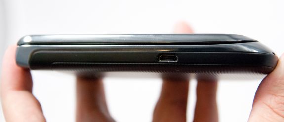
The left side is pretty generic. You’ve got a microUSB port oriented the right way a little over halfway down the side. It makes for a bit of odd typing when trying to use and charge the handset, but everyone is just as guilty as RIM for putting a USB port on the side.
Despite such a huge departure from traditional BlackBerry design, the Torch manages to maintain that singular business feeling so trademark of RIM’s other candybar handsets. Oh and anyone remember SurePress clicky screens like the Storms had? Totally absent from the Torch, thank goodness. I definitely don’t miss that.




41 Comments
View All Comments
brianmc - Wednesday, September 1, 2010 - link
When are you going to review this line of phones?StealthX32 - Wednesday, September 1, 2010 - link
Agreed. Especially since your sister site Dailytech keeps touting them as the "fastest Android smartphone".Anand Lal Shimpi - Wednesday, September 1, 2010 - link
I'm actually working on that right now :) I've had the Epic 4G for a little while now and I'm just in the middle of writing up the review :)Take care,
Anand
synaesthetic - Friday, September 3, 2010 - link
Really interested in hearing your thoughts, Anand. I've been staring very hard at the Samsung Vibrant as my old myTouch 3G is just too slow!I haven't flashed it to Cyanogenmod 6 yet (will probably do that today or tomorrow) so I'm not sure what speed boosts I'll get there, but the Vibrant/Galaxy S's AMOLED is just stunning!
linccsdfd - Wednesday, September 1, 2010 - link
is my love
this is a very good !
FATCamaro - Wednesday, September 1, 2010 - link
Yeah, I've been waiting patiently for something to push iphone4 off the top of all the charts. Maybe the Galaxy S will do it. Then it only needs a better display, camera, and apps to catch up.bplewis24 - Wednesday, September 1, 2010 - link
Since when has the iPhone4 been at the top?FATCamaro - Wednesday, September 1, 2010 - link
Not at everything, but a lot of important factors like below.http://images.anandtech.com/graphs/blackberrytorch...
http://images.anandtech.com/graphs/blackberrytorch...
Performance isn't too bad either. e.g.
http://images.anandtech.com/graphs/droidx_07191023...
sammsiam - Wednesday, September 1, 2010 - link
The Droid X comes with 8GB built in memory for OS & Apps and an additional 16GB microSDHC card. It supports upto 32GB cards for a total of 40GB possible.see this site:
www.motorola.com/Consumers/US-EN/Consumer-Product-and-Services/Mobile-Phones/ci.Motorola-DROID-X-US-EN.alt
Brian Klug - Wednesday, September 1, 2010 - link
I had it down in my own table right, it just didn't get copied over somehow. Same for the EVO 4G. Fixed!-Brian