Apple MacBook (2015) Hands-On
by Ryan Smith on March 12, 2015 9:00 AM EST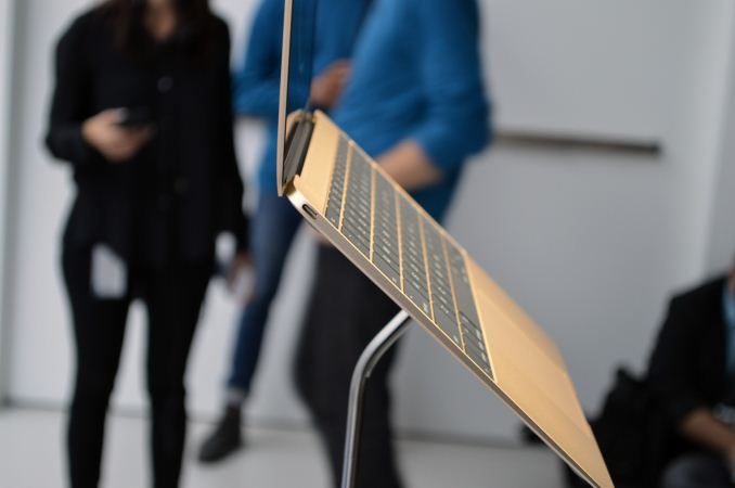
When Apple first introduced the MacBook Air back in 2008, I’m not sure anyone knew quite what to expect in the long-run from the little, low-powered Mac. Though the ultra-portable laptop itself wasn’t a new idea, there is in retrospect a distinct line dividing the Air – the first of what we now classify as Ultrabooks – from previous attempts at ultra-portables. What Apple eventually kicked off was a distinct market segment, though as a market it did take some time to materialize.
With the announcement this week of the suffix-less MacBook (2015), I’m left to wonder if Apple is doing the same thing for a new market segment. The MacBook isn’t just a new Air – though in a sense it’s an heir to the Air – but it’s something new that isn’t entirely removed from its predecessors while not being exactly the same either. The end result is a device that like the original Air is hard to pin down in this time frame, as it straddles a couple different product segments.
Mac Meets iPad
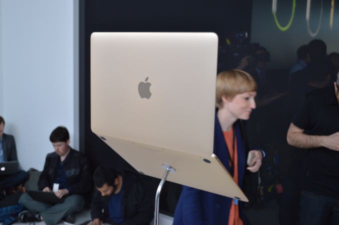
In terms of design, the MacBook is best described as what would happen if you crossed an iPad with a MacBook Air. At 2lbs it’s light, lighter than even the 2.38lb 11” Air, never mind the 2.96lb 13” model. It’s thin too, its 13.1mm thickness making it thinner than the original iPad (13.4mm), and yet it’s a clamshell laptop with a keyboard and trackpad. But despite being thin and light it’s not really small, as the 12” screen makes it larger than the smallest Air, never mind any kind of iPad comparisons.
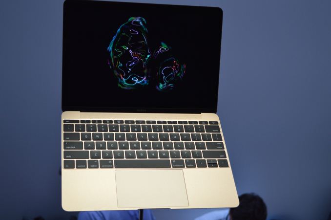
A lot of the time the MacBook ends up feeling like a Macintosh tablet, combining the form factor of a laptop and OS X with the design cues of the iPad. Externally this is backed by the use of Apple’s common glass & metal design philosophy, but I think it’s also very telling that this is the first Mac to come in various colors like iOS devices, silver, grey, and gold. Apple has never been one to shy away from making their devices conspicuous, but the metal colors really take this up a notch.
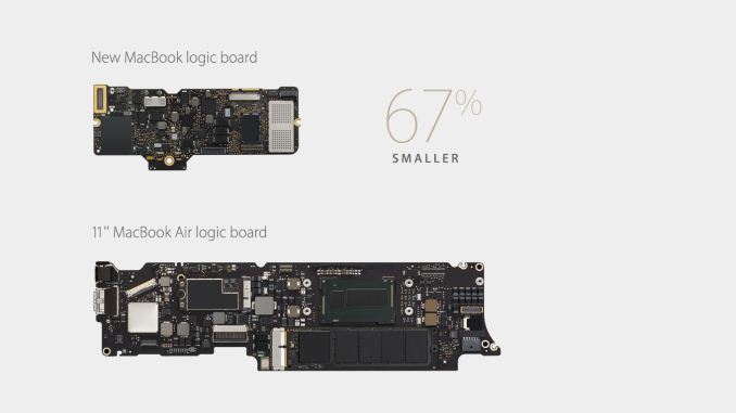
Apple’s internal component choice also reflects this design philosophy. Though this is a Mac through and through – OS X and x86 lie at its heart – Apple has shifted from Intel’s Core U-class processors in the Air to their Core-M (Y-class) processor in the MacBook. Intel’s lowest power Core processor design to date, Core-M is intended to be used in tablets and up, further driving the point that the MacBook is a tablet Mac in laptop form factor. The use of Core-M influences several design aspects of the MacBook; it’s smaller and thinner than other Intel processors, allowing for Apple to get away with a very small logic board, and at 4.5W it means Apple can rely on the relatively large 12” metal case to dissipate heat and skip the fans entirely. Which in turn has allowed Apple to fill most of the rest of the laptop’s internal volume with 39.7Wh of batteries.
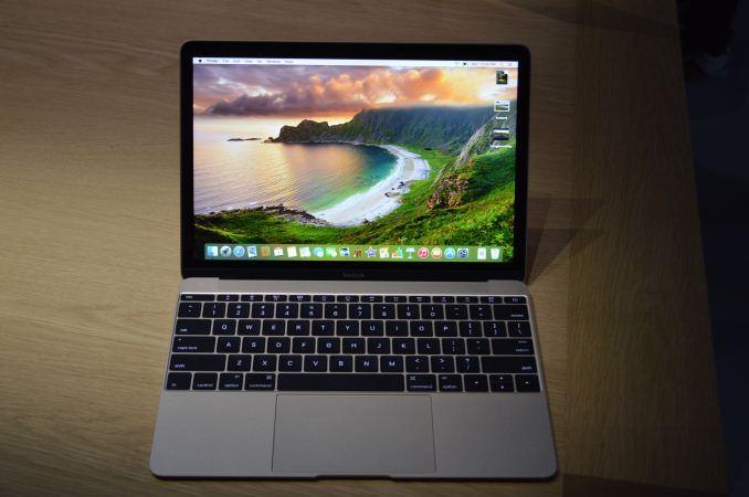
Those batteries in turn help drive the only other significant power drain on the device, which is the MacBook’s 2304x1440 Retina-class display (sorry, Air users). The use of a Retina display is not unexpected here – especially if you want to make it all the more comparable to the iPad and offer similar display clarity – but using Retina displays is always a tradeoff due to the greater power requirements that come from the stronger backlight needed to punch through the display. I wouldn’t be surprised if more than half of the MacBook’s average power consumption is the display, which would also explain why Apple’s battery life estimates are only 9-10 hours despite the low power Core-M processor. With that said, we’ll have to see how well the MacBook’s display holds up to critical analysis in our labs, but in our brief hands-on time it looked as good as any other Apple Retina display.
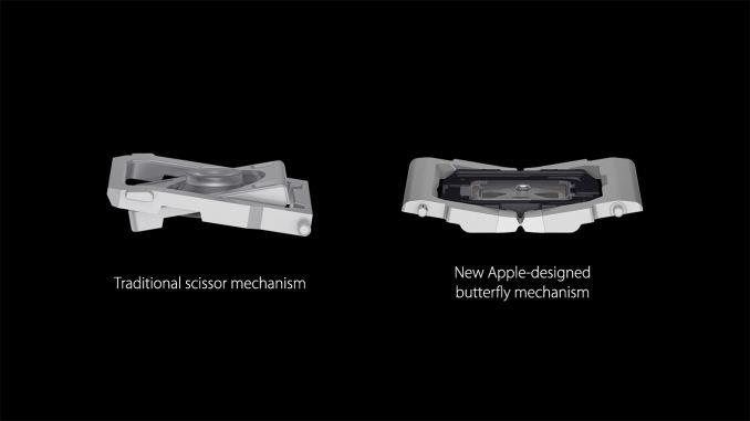
Moving on, to get a Mac laptop so thin Apple has made some other design tradeoffs in other areas, which in turn will have some interesting ramifications. For the keyboard Apple has done away with the long-standing scissor switch mechanism in place of a new “butterfly” mechanism, as Apple has pushed for keystrokes so shallow that even the scissor doesn’t work well here. The butterfly mechanism in turn is an interesting change; the resulting keystrokes are extremely shallow – think of something akin to the iPhone/iPad home button – and perhaps a bit unsettling at first, meaning it takes a bit of time to adapt to touch typing this keyboard. On the other hand the butterfly mechanism also does away with one of the scissor switch’s only real weakness, the mechanism’s trouble with off-center key presses, resulting in a key that responds the same no matter where you press it. Having used a number of different scissor keyboards over the years, and having struggled with a few of them not registering keystrokes, I think the potentially improved accuracy of the butterfly mechanism may be even more important than the space savings that Apple is really going for.
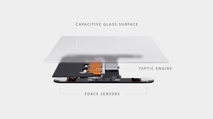
Meanwhile the keyboard’s compatriot, the touchpad, has also received its own upgrade here with the Force Touch trackpad. Similar to the keyboard, Apple’s first goal here is to save space, doing away with the switch mechanism in place of a combination of force sensors and an electromagnet “taptic engine” to simulate key presses. The result is shorter tap depth, but it also allows the MacBook to register multiple click types based on how deep the click was. This essentially manifests itself as two clicks – a shallow click and a deeper click – with Apple playing around with what to assign their new-found clicks to. Otherwise the trackpad can also be used as a variable force sensor, allowing for applications to respond based on how much force is being used.
Whereas the keyboard’s improvements were more obvious, the trackpad change is more significant and one that’s harder to judge in a short period of time, especially given the ability to adjust the pad’s resistance. It still feels like an Apple trackpad, clicks and all, but with the click varying with the force it’s going to take some practice to learn what the new clicks do in various applications, and to be able to reliably trigger the click that you want.
Side Discussion: USB Type-C
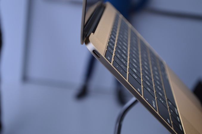
Last but certainly not least, the final design tradeoff of ports has certainly attracted quite a bit of attention, to the point that I got emails about this before I was even out of the Apple event. In scaling down from the MacBook Air, Apple has also scaled down the number of port on the MacBook. What you’ll find is a single data & power port in the form of a new USB Type-C port on the left side, and on the right side is a 3.5mm headphone jack. The Air was already light on ports, but there has never been a Mac like this before.
From a design perspective I’m sad to see the MagSafe power port go. I suspect there are first and second-order size issues at play here – Apple can’t get the MagSafe port small enough to use on the MacBook, and there’s only room for one port of any kind on each side of the laptop – so in its replacement we have an all-in-one port that does away with the magnetic safety feature in place of getting data and power down to a single port.
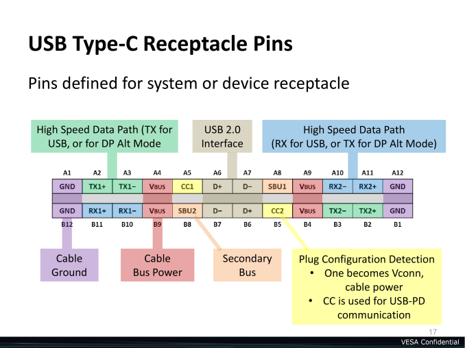
Depending on configuration specifics, Type-C ports and cables can accommodate upwards of 100W of power (5A @ 20V) along with over 20Gbps of data in various forms. And for the first time on a USB connection, they’re reversible, doing away with full-size Type-A’s infamous trinary nature, or Micro-AB’s need to figure out which side is the top or bottom. All of this comes with the ability for Type-C to be used with both hosts and devices, eventually allowing cables to be C at both ends, and allowing devices like the MacBook to be both a USB device when charging, and a USB host when other devices are plugged into it.
For Apple’s implementation of Type-C there are still a few unknowns, but there are a few common points that bear pointing out based on the email questions I have received. Using the Type-C connector does not require that a device support a specific version of USB; the connector is designed to supersede protocols, being all-around better than pretty much any other connector and purposely created to allow manufacturers to take advantage of it for its size and reversibility. Consequently we will be seeing devices with Type-C connectors and USB 2.0 connectivity (phones, tablets, etc), and even hosts won’t necessarily support USB’s fastest speeds. Put in other words, while 10Gbps USB requires Type-C, Type-C does not require 10Gbps USB.
In Apple’s case the company will be using Type-C to host 3 different functions: USB data, power, and DisplayPort video. Apple is driving the MacBook’s USB data capabilities straight off of the Core-M processor, which in turn only supports USB 3.1 Gen1 data (5Gbps Superspeed), which is otherwise equivalent to USB 3.0. To support Gen2 speeds (10Gbps Superspeed+), Apple would need to use a 3rd party USB controller at this time, which are still very new and would compromise the size of the logic board, along with potentially compromising battery life. For the moment at least I suspect 5Gbps will be enough for the MacBook, particularly if the similarly small internal SSD is unable to saturate that connection.
As for power, Apple will be supplying a new 29W Type-C power adapter with the MacBook. So far Apple has not published the full specifications for the adapter itself, but with Type-C allowing up to 5A of power, at this point Apple could be using either 12V or 20V, with the former being more likely. The use of a Type-C port and the USB Power Delivery 2.0 specification means Apple is much more strongly bound to industry standards this time, pushing them away from their previously proprietary power chargers and interfaces.
Finally, through the use of USB alternate mode functionality, Apple is able to also supply DisplayPort over the Type-C connector. Through the alt mode capability, 1, 2, or 4 lanes of USB 3 data can be replaced with alternate protocols, in this case DisplayPort. The final resolution that can be passed though is implementation specific and isn’t available in Apple’s specifications – but based on Core-M’s capabilities I suspect that Apple has it setup to use 2 lanes, which would allow a maximum of 2560x1440 (WQHD). Meanwhile DisplayPort can also be actively converted to other formats, which is what allows Apple to offer HDMI and VGA through adapters.
The downside here is that Apple has only equipped the MacBook with a single Type-C port, a single port that in turn needs to be both the power changing port and the device/peripheral port. Based on the size of the MacBook and its taper, I suspect Apple would not be able to get more than 1 port on each side of the MacBook – it gets too thin if you go any farther forward – and in traditional Apple fashion they have picked a thinner device over additional features. The use of a breakout box/multiport adapter mitigates this some, allowing charging while also offering an HDMI port and USB Type-A port, but it’s an inelegant solution for sure.
With that said, after using the MacBook and talking with the Apple employees presenting it I’m increasingly convinced that this is intentional, and not as a means to sell accessories (as would be the most obvious answer). There is one other class of Apple device that has this same kind of single data/power port and a 3.5mm headphone jack, and that is iOS devices. Going back to what we said earlier about the MacBook design coming off as a fusion of the Mac and the iPad, the port selection on the device is another element that reflects this design. With the iPad Apple only needed those two ports to make the device usable, and it’s this paradigm they seem to be channeling on the MacBook as well.
Despite being a Mac, the use scenario Apple seems to be aiming for on the MacBook is very much the iPad use scenario. Which is to say that it’s a portable device designed to be carried around, used for a period of time, and then taken back to its storage location to charge, with virtually all data transfers being wireless (through the use of dual-stream 802.11ac). Just like the iPad then, the sole Type-C port exists first and foremost as the charging port, followed by a port for connecting the very occasional accessory. The traditional Ultrabook paradigm of power and peripherals is not what Apple is shooting for in this design. Whether this is the right move is another matter altogether – for the record I’d rather have another Type-C port – but it’s easy enough to see how Apple could set out to create a Mac they want treated like an iPad rather than a Mac.
First Thoughts
Ports aside, my overall first impression is one that’s positive, but cautiously so. This is by far the most portable Mac Apple has ever created, thinner and lighter than ever, making it very easy to carry around. And while I’m a bit concerned about overall performance from a 4.5W CPU, overall the hardware is looking solid, with Apple’s keyboard and trackpad changes being very interesting solutions to shaving off further thickness without greatly compromising usability. At this point then it’s the broader picture that remains unclear; with the MacBook Apple is treading new ground by pushing a new usage model, and I think it’s going to take some time to really figure out how well that model works, if the $1299+ price Apple wants to charge is right for that model, and if that model makes sense in a world where there is already the MacBook Air.




217 Comments
View All Comments
Ktracho - Thursday, March 12, 2015 - link
Adding one extra USB port would not make it thicker or heavier, and would make it more convenient/usable for a lot of people, even if it would not be useful to you.SirKnobsworth - Thursday, March 12, 2015 - link
"Adding one extra USB port would not make it thicker or heavier, and would make it more convenient/usable for a lot of people, even if it would not be useful to you."Difficult to say - the chassis tapirs very quickly. It looks like a second USB port would have fit, particularly next to the headphone jack but I haven't actually measured it. Agreed that it would make the device a lot more useful though.
Dorek - Tuesday, March 17, 2015 - link
"I predict that this will fly off the shelves and become the single most popular laptop that Apple sells."That's hilarious.
FlushedBubblyJock - Wednesday, April 8, 2015 - link
People, apparently appleheads are not people, complain when only 3 usb ports are present and not 4.I guess it's a whole different sheep.
darwinosx - Thursday, March 12, 2015 - link
Yeah but the windows devices are cheap junk and worst of all they run windows.Jeff Bellin - Thursday, March 12, 2015 - link
Amen to that, kyuu ^. There are absolutely limits to how thin and how light a laptop can be and still be superior to heavier, thicker ones. I believe Apple, in the Macbook, has found, and surpassed those limits. First, thick/thin-ness: once you've gotten thin enough to be quite compact to store in a bag or briefcase and to pick up and carry, further thinness will not produce incremental benefits unless you are disabled and can barely carry, say, a light, thin book. We can agree that's a niche audience, not Apple's target. Otherwise, the thickness itself - independent of weight - and they absolutely can be - the only tangible result of any further thinness (than about 0.6" IMHO) is, as we can see, an inability to fit ports in to enable very useful connectivity - even to people who don't realize how useful it can be, if only rarely. Point is, no benefit to getting thinner, definite downside, for many. Now let's go to weight. I personally cannot think of a use case where a weight below about 2.5-2.75 lbs becomes a game changer. Again, except in the case of someone disabled with difficulty gripping and carrying a 2.5 lb very thin book-like device, the added weight reduction - from, say, 2.6lbs (where increasing numbers of Ultrabooks are, and more are headed) does not appear to produce any tangible, measurable benefits, but there are definite downsides to lowering the weight - to 2 lbs, and below, particularly in a form factor as small as 12", further particularly where the base of the laptop, with the keyboard, are also extremely thin. The problem with laptops that are so light and thin is that you can't use them comfortably or efficiently - uh, er, in your lap! The same often applies to thin, bouncy tray tables on planes and trains.Here's a real-life example: I've been a laptop fanatic since they were invented (handle on Notebook Review and Tablet PC Review is "Lovelaptops!") and for the past 7 years have chased the lightest, thinnest ultraportable, then ultrabook available, with the most powerful specs and greatest versatility, best screen, etc. In 2011 I discovered what I thought was the holy grail. It was the now legendary - if you're in the right crowd - Sony Z, a.k.a. the Z1, first in the series of 3 from 2010-2013. It had a 13" screen, Raid0 SSDs up to 512GB (in 2010, recall), nVidia d-GPU, every port you could imagine, WWAN,2 SD slots, ExpressCard slot, Ethernet, 4USB, VGA, a blu ray burner (which could be yanked out and replaced with any 2.5" HDD or SSD), backlit full travel chiclet keyboard, user replaceable RAM, battery, wifi and WWAN cards, even the semi-proprietary SSDs could be expanded FHD 95% Adobe RGB color gamut (perhaps irrelevant here, but point is this was a far better laptop than the Macbook, most ultrabooks and the MacBook Air of 2012-2015. It weighed 3.06 lbs and was 0.75" at its thickest. It was also $2,500 - $3,500 and sold like hotcakes because, well, it was that good, that revolutionary, particularly for its power+versatility/size+ weight ratios. The machine was a thing of beauty (all aluminum one piece keyboard deck, magnesium/carbon fiber lid). I was salivating for it, waited until they went on sale. I took it home, set it up and proceeded to use it at my desk, and I was in heaven.
Then I started testing it out on my lap. :( :( :( Grrrrrrrr! The darn thing just kept bouncing in my lap no matter how lightly I tried to press the keys. Even with a 13" form factor, I just couldn't find a place to balance it on my legs. The screen would wobble with every key press. (I kept it and loved it and still use it, but never on my lap and rarely even traveled with it because of the bad balance on airplane tray tables.) If this sounds familiar at all, you may have or once had a Microsoft Surface Pro, especially the SP3, as the first two were non-starters on your lap. But the SP3 has a larger footprint, better weight distribution between keyboard and screen parts and the "magical" infinitely adjustable kickstand. Still, it proved to be virtually unusable on your lap. Guess what? It weighs about 2 lbs has a 12" screen and the keyboard is incredibly thin and light - very similar in form and weight distribution to the new Macbook. It too only manages one USB port, but that's in addition to a (Apple copy) magsafe type power port and a mini display port. For any kind of professional or business person, this would be the absolute minimum amount of connectivity.
Sorry for writing such a long tale to make a simple but incredibly relevant - IMHO - point that illustrates the folly of continuing to make laptops thinner and lighter. Tablets and phones? Pretty much no problem, though gripping a really thin phone can be annoying, subject to being dropped more easily. If you truly can get used to the highly unconventional keyboard and track pad, and you just adore OSX and hate Windows. One of the worst things about Apple coming out with the Macbook at this time is that it probably signals the end of development of more features on the MBA, particularly putting a decent screen on it. So you may think the with the MacBook Apple has created a paradise for those seeking powerful computers that are thin and light as a feather, but I beg to differ. I feel that Apple has permanently relegated the MBA to second class status (or it would surely cannibalize sales of the Mac Books) which means that professionals have one and only one technically Ultraportable laptop and that is the suitable for working professionals and business people, and it weighs in at 3.6 lbs and 0.71 height/thickness. I am not an OSX fan but even if I was, now would be the time I would give Windows 10 a try and look into all those sleek, sexy Ultrabooks made by Lenovo, Asus, even Acer, Dell and HP, averaging about 2.7 lbs and 0.6 - or I'd lug around a 3.6 lb rMBP 13 for the same performance, feature set and screen caliber of all those Windows Ultrabooks but at a higher price, 0.5-0.8 lbs heavier, pretty rotten experience running Windows with lack of driver support proudly bragged about by the manufacturer. Take heart though: it's not really ugly!
modulusshift - Friday, March 13, 2015 - link
The MacBook isn't top heavy. Most of the weight will be contained in the batteries at the bottom, easily the densest part of the computer. It's not going to bounce that badly, else they wouldn't have let it out of testing.Besides, the reason the SP3 bounces so much is because the keyboard is literally suspended above the surface the computer is resting on.
mkozakewich - Saturday, March 14, 2015 - link
As a Surface Pro user, I can vouch that I rarely need the USB port, except for storage. It would get really annoying if the charger doesn't also contain a USB port or two, but I think that's already far-fetched. I can't stand devices that I can't charge while something is plugged in.Speedfriend - Thursday, March 12, 2015 - link
"Wireless DSLR cameras are getting common." - in Canon's current rnage, only 5 of 15 camera models have WiFi, and 95% of the installed base wouldn't have WiFi.If this was a Microsoft product, you would be on here telling us how they didn't understand the market.
easp - Thursday, March 12, 2015 - link
1. Wifi SD cards aren't all that expensive.2. It is a perfectly legitimate product strategy to target a subset of the market, such as those who are happy to be closer to the bleeding edge.
3. You can plug a camera into this thing if you need to.