Apple's iOS 4 Explored
by Anand Lal Shimpi on June 22, 2010 3:27 AM EST- Posted in
- Smartphones
- Apple
- iOS 4
- Gadgets
- Mobile
Steve Jobs stood on stage and proclaimed the iPhone 4 would be the biggest advancement since the introduction of the original iPhone. It’s a bit of a self fulfilling prophecy. Steve says it, folks get extra excited, and pre-orders go through the roof.
Granted it’s not all fluff. The faster SoC, smaller size and new industrial design are usually enough to sell a smartphone, much less a new iPhone. But add in a ridiculously high resolution display and you’ve got the potential for cool.

Yesterday the pre-launch festivities began with the official release of the fourth version of Apple’s mobile operating system: iOS. The new release, dubbed iOS 4, is available for the iPhone 3G, 3GS and iPhone 4 although it only offers the full set of features on the iPhone 3GS and iPhone 4. Unfortunately iPad users will have to wait until this fall to get the update.
The biggest features from an end user standpoint are the introduction of folders as a way of grouping apps together and simplifying your the iOS interface and of course, multitasking.
Folders
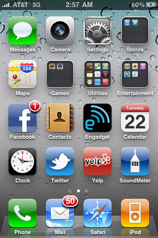
On my iPhone I have five screens of apps. That’s ridiculous. And as odd as this sounds, I can never find the flashlight app when I need it. When the iPhone 3G came out I mentioned that the simplicity of the iOS was being jeopardized. With apps and the new functionality Apple was trying to enable, everything got more cluttered. The original iPhone was a success due to how clean and efficient its UI was. While I believe that iOS3 still has the edge there, it’s one that is quickly eroding.
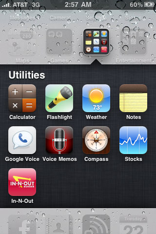
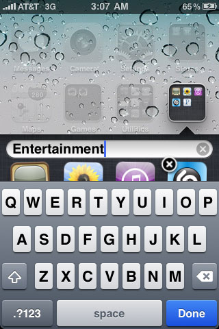
Folders is Apple’s temporary solution to the problem, and it seems to work. Press and hold your finger over an app icon on your home screen, wait for the icons to start jiggling, and then move one icon over another one. The two will form a group called a Folder and the Folder will be automatically named based on the type of apps in it. You can also rename the Folder.

A Folder in iOS 4

Renaming a Folder
With a bit of organization, I could reduce my five screens of apps down to two. With some pruning of unnecessary apps I got it down to one. Much better.

Like many features in iOS 4, Folders are both an improvement and a burden. The burden comes from the fact that you now have to tap, wait for a folder expansion animation and then tap again to launch an app in a folder. Folders also remain “open” until they’re closed. Meaning if you launch an app in a folder, when you return to the home screen you’ll actually end up in the last folder you were in. Hit the home button a second time to actually get to the home screen. I suspect this is a bug that Apple will fix however.
It’s also very easy to forget what you put in each Folder (you can store a maximum of 12 apps in a Folder). The Folders all look the same and although they give you a little preview of what’s inside it’s often difficult to tell. I’ve found that the best solution for me is to keep frequently used apps directly on the home screen but put everything else in Folders. Keeping everything on a single home screen also really helps keep things tidy and efficient. If you do have a ton of apps and can’t remember what folders you put them in, the Spotlight search is probably going to be even more important to you now than it has ever been.
I called Folders a temporary solution to the problem because eventually Apple will have to come up with new ways to deal with app and data organization, not to mention task switching. None of the features that show up in iOS should be a surprise, we’re seeing a repeat of the history of the PC, just in revised form. Apple and Google (eventually Microsoft as well) are looking to recreate the evolution of the PC not just in hardware but software as well, but they’re looking to do it without the mistakes. That’s why Apple is so adamant about defending its closed platform.
When we get true multitasking and once these mobile devices turn into active productivity devices rather than passive consumption devices then we’ll need much more than Folders. Remember the first time you saw the Start menu? You’ll probably get a similar feeling in the next few years on a smartphone OS.


46 Comments
View All Comments
Sazar - Tuesday, June 22, 2010 - link
Folders reduces clutter and reduces the number of swipes/pages you need to navigate to :)Essentially, I went from 6 pages of apps to 1, when I put everything into folders, labelled correctly. It takes a little getting used to and it is definitely a little different, but reducing clutter == props from me.
Nehemoth - Tuesday, June 22, 2010 - link
In the calendar I do not understand why apple (or any other big player in the smartphone area) don't allow calendar information to be added.For example, I live in Dominican Republic, we have a lot of not-working days in the year, so would be amazing if we can find a way in which we tell to the apple calendar which are those days, more amazing even would be if for example we have the option so those days the alarm doesn't sound as is expected the normal days.
wittaker25 - Tuesday, June 22, 2010 - link
Just use google sync to get google calendar on your phone. You can mark off-days through google calendar. Works with my ipod touch.mathias_mm - Tuesday, June 22, 2010 - link
You can probably find a feed somewhere on the net that has those in it - i know it exists for Denmark, which is all i need.I have no idea if this calendar is any good (I searched for dominican republic holidays ical feed on Google):
webcal://ical.mac.com/horacio.vicioso/Efemerides%20Rep%C3%BAblica%20Dominicana.ics
So, you take that link and paste it into your phone. This has to be done in a weird spot, i think it's inside the mail art of settings where you tap add account, and you can then choose calendar. Then the phone will add all the dates from that feed into the calendar app. Any changes done in the feed will also be updated on your end.
ltcommanderdata - Tuesday, June 22, 2010 - link
You forgot to mention when listing supported devices that iOS 4 is available for 2nd and 3rd gen iPod Touch as well. What's more, it's free. As an iPod Touch owner this is one of the most important aspects of iOS 4. Device fragmentation may be getting worse with the introduction of the iPad and now iPhone 4, but at least OS fragmentation is being addressed.Hopefully, you'll be able to run some performance comparisons between iOS 3.1.3 on the iPhone 3GS and quite important for those users, iPhone 3G.
dumpsterj - Tuesday, June 22, 2010 - link
why wont they bring this stuff to verizon ? im using an almost 2 year old samsung omnia. Im waiting out to see what windows phone 7 brings to the table (im a zune guy). I would seriously consider switching to the ipod/iphone ecosystem if they would bring it to verizon. However , after spending time with a friend who had att , his phone cut out all the damn time while my old omnia and vzw had no problem. Ill never use ATTCiNcH - Tuesday, June 22, 2010 - link
I don't really get the test with multitasking and the conclusions that were made concerning battery life. If you are doing two expensive tasks at the same time, it will of course drain the battery. With Pandora running in the background, you get about a fifth less of time for web browsing (either 3G or WiFi). Isn't that reasonable? I mean someone has to decode audio.. and according to the specs, the iPhone can do so for about 40 hours and not an infinite amount of time.vol7ron - Tuesday, June 22, 2010 - link
"...when you return to the home screen you’ll actually end up in the last folder you were in. Hit the home button a second time to actually get to the home screen. I suspect this is a bug that Apple will fix however."I have not upgraded yet, but I could see this as a good thing, rather than a bug. With a JB iOS, there is an app called Categories, that provides the folder functionality. It performs how you would like: you go to an app, when you hit the home button, it takes you back home, not back to the folder.
I'm not a fan of that. One of my folders is "websites" or "print," which house apps from websites (eBay, Wikipedia, YouTube, Facebook, etc) or journal apps (Wall Street Journal, Financial Times, USA Today, RSS Reader, TechCrunch, etc), respectively. If I'm getting my daily reading in, it's annoying to have to keep re-opening the folder. The same would be true if you're in a mood to play games. I'd be more likely to go from game to game.
I could also see this feature having benefits. If you put all your primary apps in a folder, then essentially you could create a home screen folder, thereby negating the need to go to the actual home screen. What I hope to happen is that the Springboard will be filled with folders, instead of apps. I may also hope to put folders inside of folders.
vol7ron
solipsism - Tuesday, June 22, 2010 - link
I'm with you. I can see Anand and/or Brian's point on the matter as a personal preference, but the best method is to have a folder remain open until the user chooses to close it.If you need to get out of the folder quickly just hit the Home button again or hit anywhere outside the folder, but if you need to get back to the folder constantly it can be annoying to flip pages, open the folder and then click another app.
Sazar - Tuesday, June 22, 2010 - link
Yah, I see their point but I have had no problems navigating in folders right now.I can still get back to the home-page, with an extra click, but it sure as heck beats the swiping from side to side to get to what I wanted before.
Still getting used to it.